
Getting your perfume packaging artwork ready for production is a critical step that bridges creative design and manufacturing reality. Without properly prepared files, even the most stunning bottle design can suffer from blurry logos, off-brand colors, or costly production delays. This guide walks you through the technical essentials so your artwork meets factory specifications the first time—whether you’re working with folding cartons, rigid boxes, labels, or direct-to-glass printing.
Essential Artwork Specifications
Color Mode and Accuracy
Use the printer’s approved color workflow and output profile. Confirm how process color, spot colors, placed RGB assets and transparency will be handled in the final file. Judge the exported artwork by preflight and proof results rather than assuming that a particular software or color-mode label guarantees correct output.
Agree a physical color target, measurement/tolerance where needed and the intended substrate. Specify spot colors only where required by the process; a swatch name alone does not guarantee an identical result on different materials.
Resolution and Image Quality
Agree minimum effective raster resolution at final print size with the printer and check each placed image in preflight. Keep logos, type and technical paths editable or vector where the accepted workflow requires it. Do not impose a single resolution for every process and viewing distance.
File Formats for Handover
Obtain the current printer’s file specification first: accepted format/version, PDF preset, color profile, fonts, linked assets, transparency and spot-separation rules. A correctly exported PDF can still fail preflight; the approved output file and proof are the production references.
A quick reference for acceptable formats:
| File or asset | Confirm with printer | Preflight evidence |
|---|---|---|
| Production PDF | Accepted PDF standard/preset; color/spot handling; fonts | Preflight report; page/trim/bleed boxes; separations |
| Native design package, if requested | Application/version; linked images; permitted font handover | Open/package check; missing assets resolved |
| Raster artwork | Effective resolution and color profile | Output-size quality check |
| Dieline/technical layers | Revision, scale, layer names and print exclusion | Cut/fold/finishing alignment and separation proof |
Dielines, Bleed, and Safe Zones
Understanding the Dieline
Use the supplier-issued dieline at its approved scale and revision. Keep cut, crease/fold, bleed/safe area and finishing information distinguishable, following the printer’s required naming and technical-layer handling. Overprint settings alone do not make a dieline non-printing; verify that production separations exclude technical guides.
The printer should confirm bleed for the substrate, cutting process and artwork. Extend edge artwork by that approved amount and verify the exported bleed/trim boxes; the value is a project parameter rather than a universal 3–5 mm rule.
Illustrative layered dieline example
The original example below separates cut, fold, bleed, foil and white-ink information. It is fictional and not production-approved: no dimensions, accepted bleed value or working carton structure are provided. Use it to discuss layers with your printer, not to manufacture packaging.
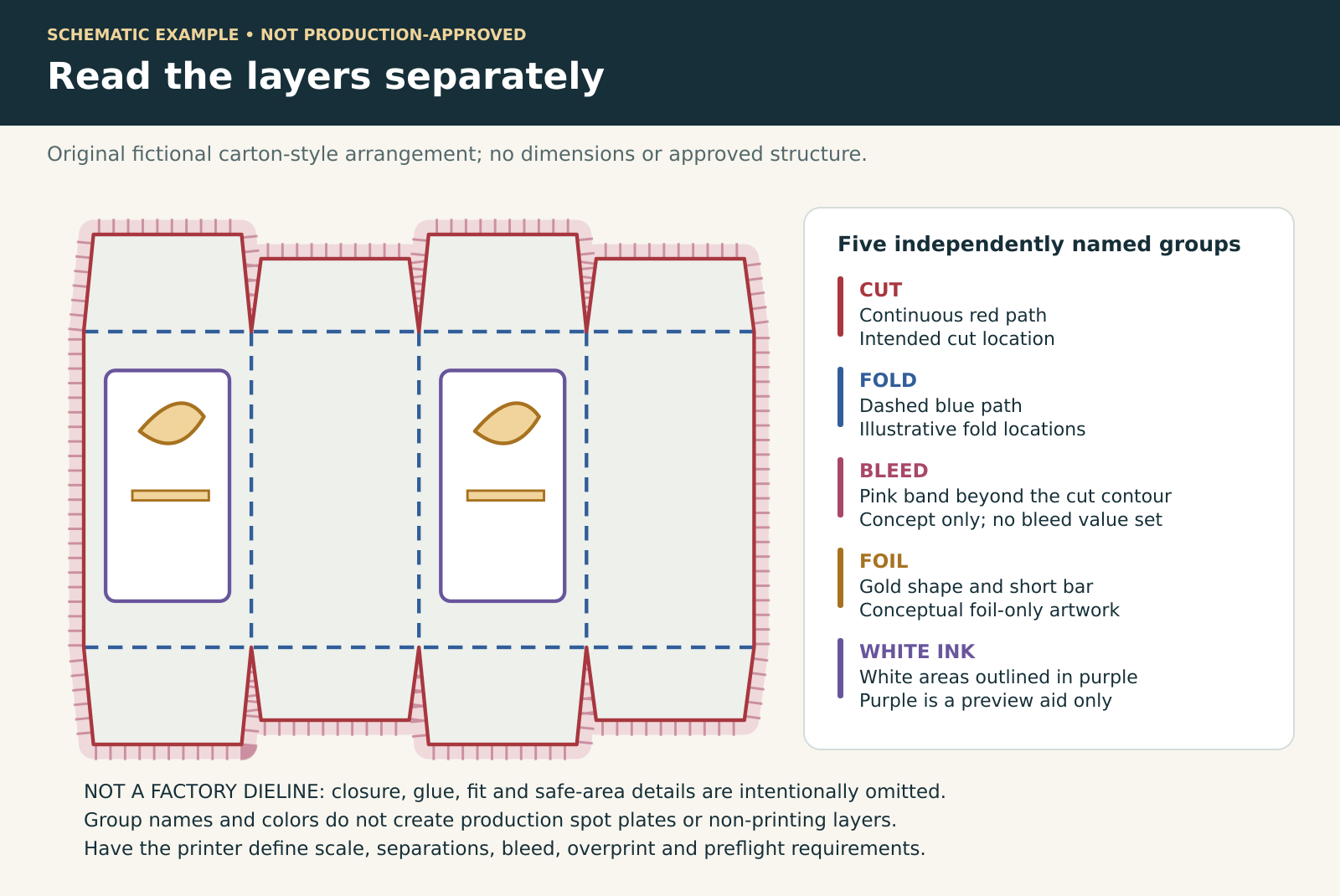
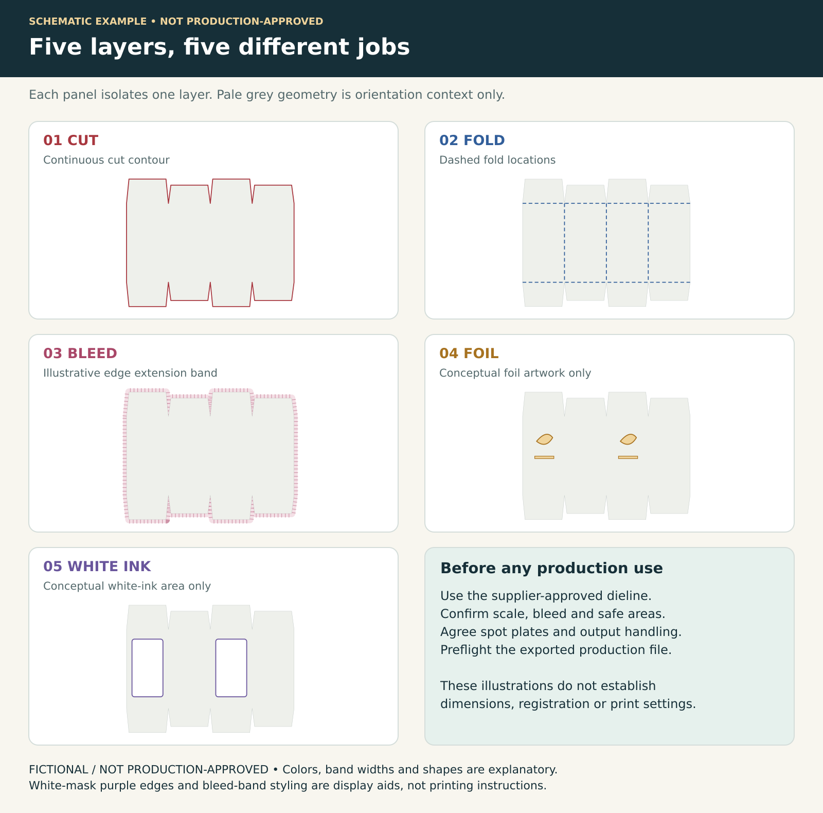
Download the fictional layered SVG example and README (ZIP)
Educational SVG and README. Fictional, incomplete and not production-approved. Do not manufacture from this file.
The editable SVG contains independently named CUT_GUIDE, FOLD_GUIDE, BLEED_GUIDE, FOIL_MASK and WHITE_INK_MASK groups. Pale-grey geometry, colored guides and mask outlines are visual aids. SVG group names alone do not create production spot plates or non-printing layers; agree the supplier’s approved dieline, layer conventions, output settings and preflight checks.
Safe Zone Margins
Agree safe margins from cuts, folds, seams and glue areas with the supplier. Check mandatory text and symbols separately for the destination market’s applicable legibility requirements.
Typography and Font Management
- Confirm minimum positive/reversed text sizes and line widths for this substrate and process.
- Embed fonts or outline text according to the accepted workflow; inspect the exported file at final size.
- Agree black builds and registration-sensitive elements with the printer.
- Have a qualified reviewer approve mandatory label content and legal legibility; a generic point size is not a regulatory clearance.
Proofing and Approval Stages
Digital Proofs
Agree whether the proof is for layout, color or finishing. Check page geometry and content separately from color accuracy, and have the printer confirm which color targets the proof can reliably represent. Request a suitable physical target or production-material proof for critical colors.
Wet Proofs and Press Checks
Agree any press or production-material proof needed for the project. Where foil, embossing, varnish or other finishing is involved, request a specimen that includes the relevant operation; an ink-only proof does not demonstrate every finish.
Labels and Direct-to-Glass Considerations
Perfume bottle labels and screen-printed glass each have unique artwork demands. For pressure-sensitive labels, multipage PDF files must clearly separate each layer: primary label, back label, and any peel-back booklet. For screen printing on glass, line artwork must be separated by ink color, with positive and negative areas clearly indicated. Tolerances are tight—fine serifs and delicate hairlines often close up or break on curved bottle surfaces.
Common Artwork Errors That Delay Production
- Unmanaged color or incorrect output profile for the agreed workflow.
- Missing approved bleed or artwork crossing unsafe fold/glue areas.
- Technical dieline accidentally included on a print separation.
- Missing/substituted fonts or linked images.
- Insufficient effective image resolution at final print size.
Frequently Asked Questions
Can I submit my artwork in Canva or a similar tool?
The deciding factor is the exported file and the printer’s preflight requirements, not the application name. Ask the printer to inspect your output for page geometry, bleed, resolution, fonts, color management and any required spot/finishing separations. If it fails, repair only the missing requirements or have the artwork prepared in a workflow the printer accepts.
What is the difference between Pantone Coated and Uncoated?
Coated and Uncoated references show color appearance on different paper surfaces. Confirm the relevant library, physical reference and actual substrate with the printer; do not assume the same identifier will look identical on another stock or that a screen preview predicts the result.
How do I prepare artwork for metallic foil stamping?
Provide a clearly named foil separation with the vector areas to be stamped, following the printer’s layer/color convention. Confirm minimum line/gap size, registration tolerance and suitability for the intended foil and substrate through a proof; do not treat one line-weight value as universal.
Do I need to include barcodes in my artwork?
Include the approved barcode data and artwork where required. Confirm symbol type, size, quiet zones, placement and print quality with the relevant specification and printer; resizing requires review. Verify the printed proof rather than assuming a vector file guarantees scanning.
Layer and production confirmation sheet
| Separate layer or check | Project-specific confirmation |
|---|---|
| CUT / CREASE | Supplier dieline revision [ ]; scale [ ]; technical-only output handling [ ] |
| BLEED / SAFE AREA | Bleed [ ]; safe margins [ ]; process/substrate [ ] |
| FOIL / WHITE INK | Separate named spot plates [ ]; knockouts/overprint [ ]; registration [ ] |
| TEXT / LINE / IMAGE | Positive and reversed minimums [ ]; effective resolution [ ]; fonts [ ] |
| APPROVAL | Preflight report [ ]; physical proof [ ]; printer acceptance [ ]; market-label review [ ] |
To discuss artwork preparation for your fragrance packaging, Request a Quote and confirm the printer’s file requirements, proof scope and approval responsibilities.